Colour Trends of 2017 – Part 1
Shabby & Chic & Everything Neat
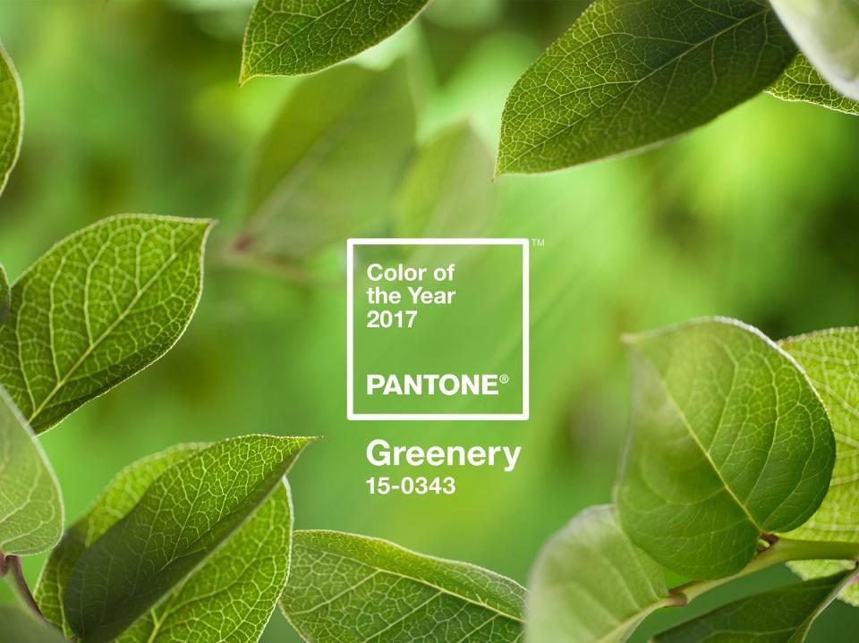
We’re Keen on Green
For those of you who don’t already know Pantone’s Colour of the Year for 2017 is a vibrant spring inspired hue called Greenery. Pantone describes the colour as: “Illustrative of flourishing foliage and the lushness of the great outdoors”. This was the inspiration for my next piece.
Take a Deep Breath!
I know what you might be thinking, green is bold and bold can be scary! When it comes to interior design and painting furniture many of us tend to stick to muted, neutral tones such as Annie Sloan’s Old White or French Linen. We use brighter colours only as accents. There is no harm in remaining neutral, these colours are classics and will never go out of style.
Greenery, like the Chalk Paint™ colours Antibes, Florence or Amsterdam Green, challenges us to step outside of our comfort zone and get inspired. Do not underestimate the power of positive change and nature’s ability to improve our well being. Bring the outdoors in.
Botanical Inspirations
While I was inspired by this luscious shade of green I was equally intrigued by a book of botanical prints I had recently acquired. I knew that I could create something very special with this combination.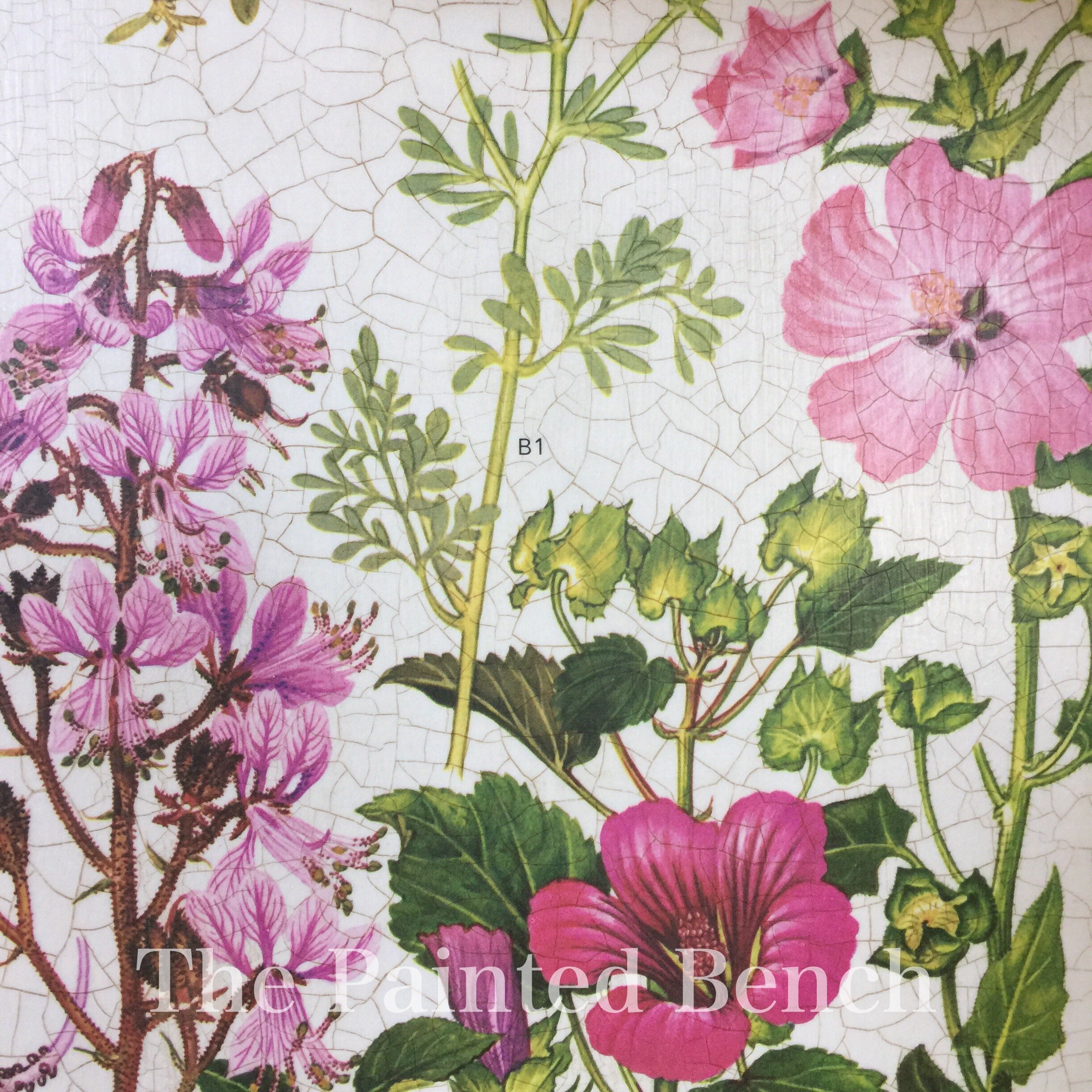
I used several colours to make my version of Greenery. Olive, Amsterdam Green and Antibes with a touch of English Yellow was just what I was looking for. Perfect for the greens in my prints.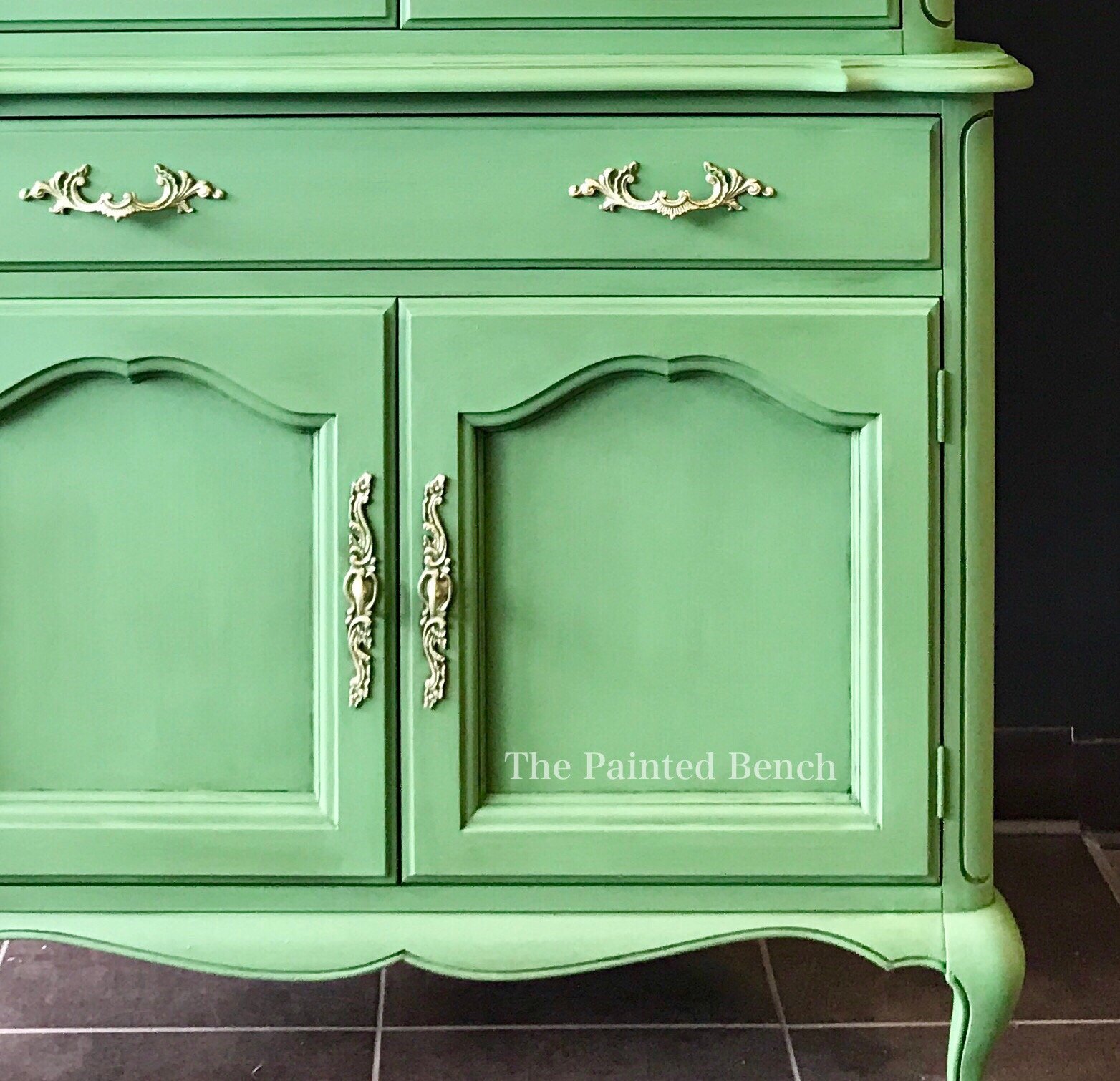
Most of us wouldn’t paint every piece in a room like this but you have to admit its a perfect accent colour.
Can’t Commit?
If you’d like to get that pop of nature into your room but you just can’t make the change from your neutral pieces, all is not lost! Designers have embraced green this year in all kinds of ways.
Exotic prints with lush, green palms, tropical-pink flamingos, yellow pineapples and large scale florals will help create a jungle-chic motif in strong bright colours.
Cacti and succulents are very trendy right now. Introduce them into your space with pops of blue and pink. We highly recommend Annie Sloan’s Scandinavian Pink, Aubusson Blue and Arles layered for a more muted look.
From lime to emerald, this hue will work throughout your home in so many fun ways. Dare to be different, go green and make a bold statement this season!
Happy painting everyone!
Melanie
You can find your local Annie Sloan Stockist here.